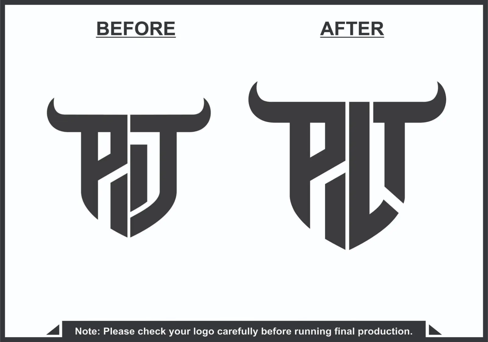
The Challenge
The original PAT monogram logo had a strong concept but faced several design limitations:
The letter structure was slightly unbalanced and visually compressed.
The A and T characters blended together, reducing readability.
Some internal angles and spacing created visual tension and uneven weight distribution.
The logo needed stronger scalability for digital platforms, merchandise, and branding materials.
The horn-inspired top element looked good conceptually but needed better alignment and symmetry to appear more professional.
The goal was to refine the existing concept rather than redesign it completely, keeping the brand identity intact while improving clarity and impact.
Our Solution
The redesigned logo focused on precision, balance, and readability while maintaining the aggressive horn-inspired identity.
Key improvements included:
Clearer separation between P, A, and T to improve letter recognition.
A center vertical axis was introduced to create stronger symmetry.
The T structure was redesigned to align better with the overall geometry.
Internal negative spaces were optimized to enhance visual flow and balance.
Stroke thickness was adjusted to maintain consistent weight across the mark.
The horns were refined to give the logo a more powerful and polished silhouette.
The final result is a clean, bold monogram that works effectively across digital, print, and apparel applications.